What should a small business website include?
A practical guide to the pages, content and enquiry journey a small business website needs, from clear services and real proof to local SEO.
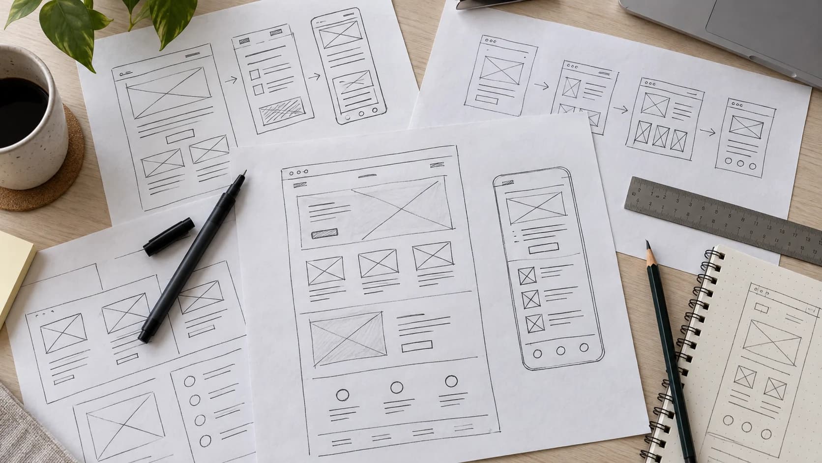
A potential customer hears about you from a friend. They open your website on their phone, have a look around and try to work out whether you can help. That's the visit to plan around.
Colours, photographs and layouts all play a part. Underneath them, though, there needs to be a straightforward conversation: here's what we do, here's why you might choose us, and here's how to get started.
You can have that conversation on a fairly small website. The trick is knowing what deserves a page of its own, what needs explaining and what can wait.
Help people recognise the right business
Your homepage should introduce the service in language a customer would use. “Quality solutions for your business” could belong to almost anyone. A joiner might say “Fitted wardrobes and alcove storage in Northumberland”. Now the visitor has something to work with.
From there, a little more detail helps: the sort of customers you work with, the area you cover and a route to the service they're interested in. A few relevant project photographs can give that introduction some substance.
The homepage doesn't have to contain the whole business. Give it a clear job: help someone find their way to the part that matters to them.
That also makes choosing a main action easier. “Request a quote”, “Book a consultation” and “Place an order” suit different businesses. Pick the action you can actually support, then put it where a visitor is likely to be ready for it.
Give each service enough room to make sense
Once someone has found the right service, they'll have more specific questions. What does the work include? Is their job the sort you take on? How does it start?
A short list on the homepage probably won't answer all of that. A dedicated service page gives you space to explain the work, show a relevant example and say what happens next. You can also make the boundaries clear: perhaps you fit supplied products but don't supply them, or offer repairs only within a particular area. Those details help both sides avoid an unsuitable enquiry.
At Lineup, website design and software development have separate pages because the conversations are different. A website owner may be thinking about copy and enquiries. Someone commissioning an internal tool needs to talk about the work their team does and the systems it already uses.
That's a good reason for two pages. Repeating the same service description with a different town name offers much less to the reader.
Show the work behind the promise
By this point, a visitor may understand what you offer. The next question is whether they trust you to do it.
Real work helps here. For a trades business, that might be photographs of a finished job with a few lines explaining the brief. For a software business, screenshots need some context: what was the customer trying to do, and how does the system help them do it?
A case study becomes more interesting when it explains a decision. Why was that material chosen? What was awkward about the existing booking process? What did the team need to manage once an order arrived?
You don't need a dramatic success percentage to tell that story. If you've measured a result, give the period and explain what the number means. Otherwise, describe what you delivered. Readers can still learn plenty from it.
Customer quotes can sit alongside that work, provided they're accurate and approved for publication. The same goes for photographs and screenshots. Our project pages show how we bring the work and its explanation together.
Let people meet the business
An About page is a chance to answer the questions that don't quite belong on a service page. Who runs the business? Who will answer the enquiry? What will working together feel like?
A real photograph and a specific explanation of your approach can do a lot here. If customers will deal directly with the owner, say so. If several people will be involved, explain their roles. There's no need to make a small business sound like a much larger one.
Location deserves the same honesty. Being based in Prudhoe and working across the North East is a perfectly good arrangement. It doesn't need to become an office in every town you serve.
With the service, the evidence and the people explained, the visitor should have a fair idea of whether to get in touch. Make that part easy.
Make getting in touch feel straightforward
Open your website on a phone and try the contact route yourself. Read the service page, find the next step and complete the form. You'll quickly notice a button that's hard to find or a question that needs explaining. The text, menu and form fields should all be comfortable to use without zooming in.
A useful enquiry form collects enough to start a conversation: usually a name, a way to reply and a description of the job. Other details may matter too, but each extra field should earn its place. Someone asking about a repair shouldn't have to complete a procurement questionnaire.
Clear labels help people get it right first time. If something is missing, the message should explain what to fix. Once the form is sent, the visitor needs to know whether it worked and what happens next.
There's another half to that test: the message arriving. Follow it through to the right inbox or staff system and check that someone can pick it up. A pleasant confirmation screen doesn't help much if the enquiry has gone missing behind it.
Some customers will prefer to phone or email, so keep those details easy to find too. Offer the routes your business can monitor. If the office then copies every enquiry into another tool, that's worth discussing as part of the systems and automation work.
Add booking or accounts when they help the customer
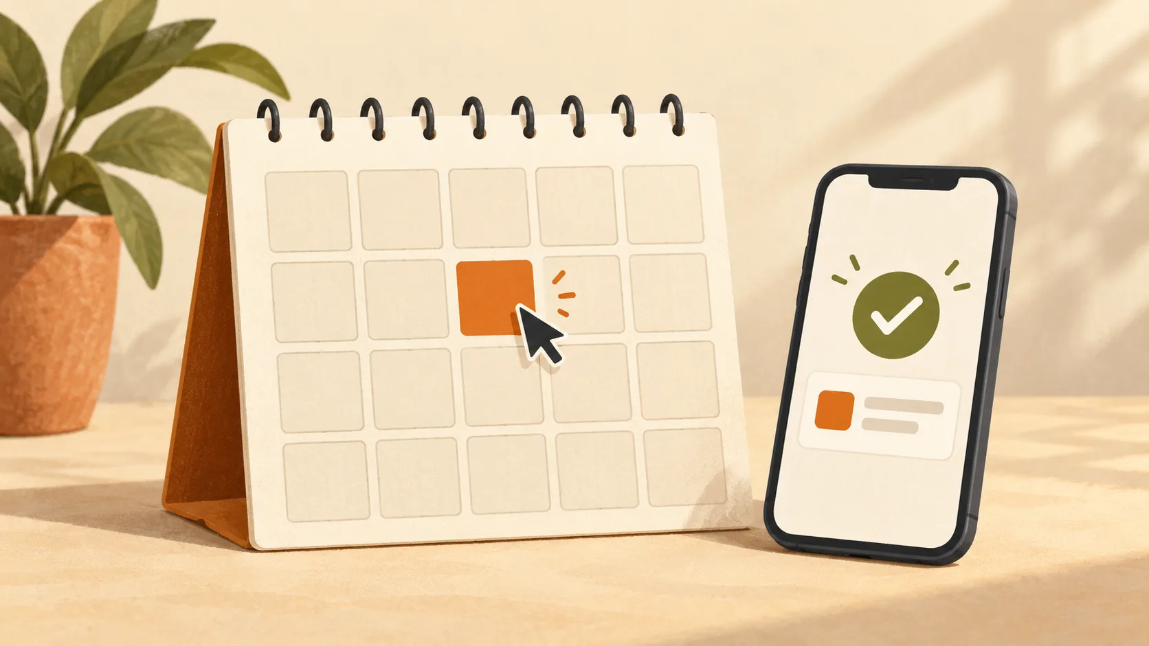
A booking calendar can be a useful next step. It can also promise something your team hasn't agreed to yet.
If choosing an available appointment confirms it, the website should explain the service, price and arrangements for changing it. Availability needs to account for the people, equipment and preparation involved. Our booking system guide walks through those decisions.
For work that needs a conversation first, a booking request or enquiry may fit better. The customer should be able to tell which one they've sent.
Accounts need a reason of their own. A regular customer might welcome somewhere to check progress, approve a document or find a previous order. A first-time visitor asking a simple question may wonder why they're being asked to register.
The difference between a portal and a CRM is helpful here: the customer's task and the office's task can use the same information, but they're different jobs. Planning both prevents a shiny account area from leaving staff with another place to check.
You can add these features later. A smaller website that supports the current service properly gives you something solid to build on.
Help Google understand the same story
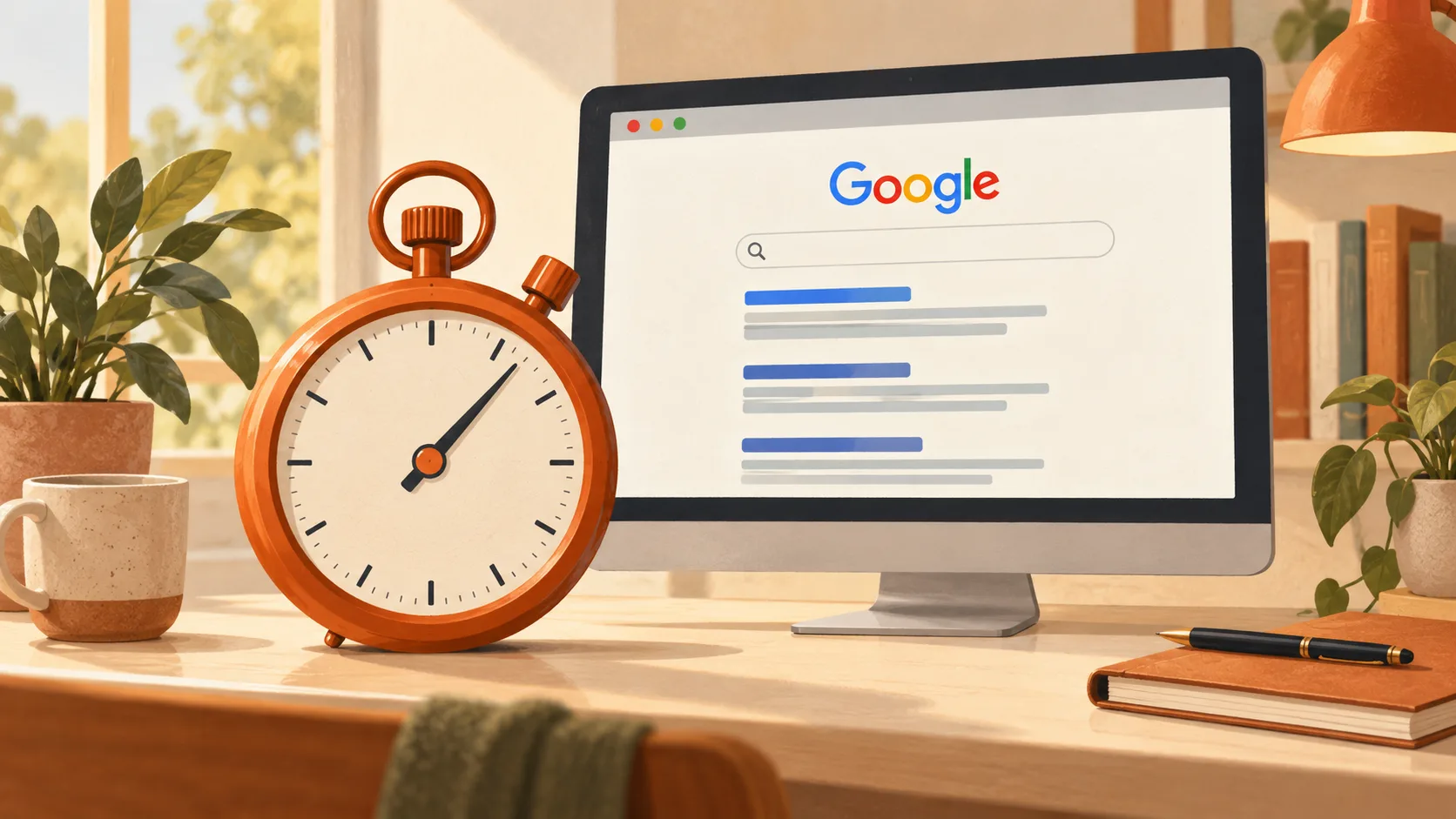
The content you've planned for customers is also the place to start with search. Give pages descriptive titles, use headings that explain the subject and link related information together. Where location matters, describe the area you actually serve.
Google's SEO Starter Guide recommends clear titles and helpful content. Its people-first guidance makes the wider point: write something useful for the person reading it.
For a small business, that might mean giving an important service a proper explanation before starting a large blog. Or adding the project photographs and answers customers keep asking for. More pages make sense when there's more to say.
Our SEO and AI search service connects that content work with the site's technical foundations. And if you're wondering when any of it should make a difference, the SEO timescales guide explains what to look for beyond a position in Google.
Leave someone in charge after launch
A website can still look smart long after its information has gone out of date. Services change, staff move on and a contact number gets replaced. Somebody needs to notice.
Agree who will update those details, add new work and check the enquiry route. If that person is you, the editing setup needs to be something you'll be comfortable using. If a supplier will do it, their responsibilities and charges should be clear.
The same applies to articles. Start with a question you can answer well, rather than committing to a publishing schedule nobody has time to maintain. Then revisit it when the advice or your service changes.
What to bring to a first website conversation
You don't need to arrive with every paragraph written. A short note covering these points gives the discussion a useful starting point:
- The customers you want to reach and the action you'd like them to take.
- The services that need explaining, including work you don't take on.
- Photographs, projects and approved customer feedback you can use.
- Your current website, contact routes and any booking or payment tools.
- Who will help prepare the content and keep it current afterwards.
Once you know what the website needs to do, it's much easier to judge a proposal. Our guide to comparing website quotes takes that next step.
If you'd like help shaping the site itself, talk it through with us. We're based in Prudhoe, near Newcastle upon Tyne, and work with businesses across the North East and the wider UK.